
In this lesson, you will learn how to create subplots in Python using matplotlib.
The Imports You'll Need For This Lesson
As before, you will need the following imports for this lesson:
import pandas as pd

import matplotlib.pyplot as plt

%matplotlib inline

from IPython.display import set_matplotlib_formats

set_matplotlib_formats('retina')
We will also be importing several data sets for the examples near the end of this lesson. Those imports will be covered later in this tutorial.
What is a Subplot?
There are many cases where you will want to generate a plot that contains several smaller plots within it. That is exactly what a subplot is!
A common version of the subplot is the 4x4 subplot. An example of the 4x4 subplot is below:
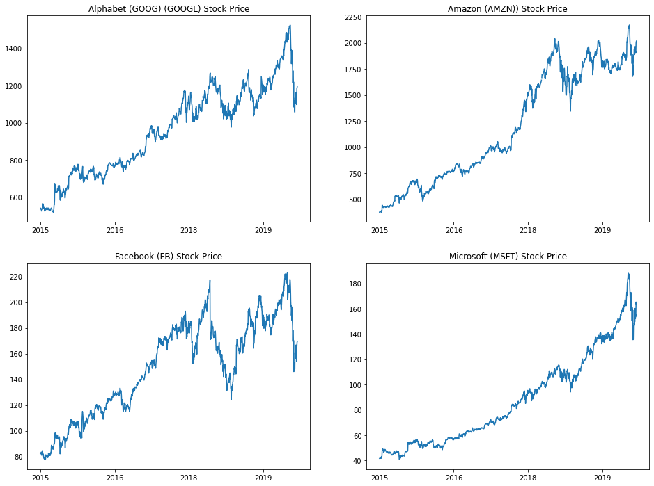
Subplots can be very complicated to create when done properly. As an example, consider the code that I used to create the above 4x4 subplot:
import numpy as np

import pandas as pd

import matplotlib.pyplot as plt

%matplotlib inline

from datetime import datetime

tech_stocks_data = pd.read_csv('https://raw.githubusercontent.com/nicholasmccullum/python-visualization/master/tech_stocks/GOOG_MSFT_FB_AMZN_data.csv')

tech_stocks_data.sort_values('Period', ascending = True, inplace = True)

google = tech_stocks_data['Alphabet Inc Price']

amazon = tech_stocks_data['Amazon.com Inc Price']

facebook = tech_stocks_data['Facebook Inc Price']

microsoft = tech_stocks_data['Microsoft Corp Price']

dates = tech_stocks_data['Period']

x = []

for date in tech_stocks_data['Period']:

    x.append(datetime.strptime(date, '%Y-%m-%d %H:%M:%S').year)


plt.figure(figsize=(16,12))

#Plot 1

plt.subplot(2,2,1)

plt.xticks(np.arange(0, len(x) + 1)[::365], x[::365])

plt.plot(dates, google)

plt.title('Alphabet (GOOG) (GOOGL) Stock Price')

#Plot 2

plt.subplot(2,2,2)

plt.xticks(np.arange(0, len(x) + 1)[::365], x[::365])

plt.plot(dates, amazon)

plt.title('Amazon (AMZN)) Stock Price')

#Plot 3

plt.subplot(2,2,3)

plt.xticks(np.arange(0, len(x) + 1)[::365], x[::365])

plt.plot(dates, facebook)

plt.title('Facebook (FB) Stock Price')

#Plot 4

plt.subplot(2,2,4)

plt.xticks(np.arange(0, len(x) + 1)[::365], x[::365])

plt.plot(dates, microsoft)

plt.title('Microsoft (MSFT) Stock Price')
This might seem overwhelming. We will work through the process of creating subplots step-by-step through the remainder of this lesson.
How To Create Subplots in Python Using Matplotlib
We can create subplots in Python using matplotlib with the subplot method, which takes three arguments:
nrows: The number of rows of subplots in the plot grid.ncols: The number of columns of subplots in the plot grid.index: The plot that you have currently selected.
The nrows and ncols arguments are relatively straightforward, but the index argument may require some explanation. It starts at 1 and moves through each row of the plot grid one-by-one. When it reaches the end of a row, it will move down to the first entry of the next row.
A few examples of selecting specific subplots within a plot grid are shown below:
plt.subplot(3,3,5)

#Selects the middle entry of the second row in the 3x3 subplot grid

plt.subplot(1,2,2)

#Selects the second entry in a 1x2 subplot grid

plt.subplot(4,4,16)

#Selects the last entry in a 4x4 subplot grid
We will work through two examples of how to create subplot grids before concluding this lesson.
Example #1: A 2x2 Subplot Grid
First, let's import the Iris data set:
iris_data = pd.read_json('https://raw.githubusercontent.com/nicholasmccullum/python-visualization/master/iris/iris.json')Using the Iris data set, let's create a 2x2 subplot with a subplot for each of the following variables (in the order they're listed):
sepalLengthsepalWidthpetalLengthpetalWidth
Make each subplot a histogram with X bins. Make sure to give each subplot a reasonable title so that an outside reader could understand the data.
Give this a try yourself before proceeding!
Once you have attempted this on your own, you can view the code below for a full solution:
plt.subplot(2,2,1)

plt.hist(iris_data['sepalLength'], bins = 15)

plt.title('A Histogram of Sepal Lengths from the Iris Data Set')

plt.subplot(2,2,2)

plt.hist(iris_data['sepalWidth'], bins = 15)

plt.title('A Histogram of Sepal Widths from the Iris Data Set')

plt.subplot(2,2,3)

plt.hist(iris_data['petalLength'], bins = 15)

plt.title('A Histogram of Petal Lengths from the Iris Data Set')

plt.subplot(2,2,4)

plt.hist(iris_data['petalWidth'], bins = 15)

plt.title('A Histogram of Petal Widths from the Iris Data Set')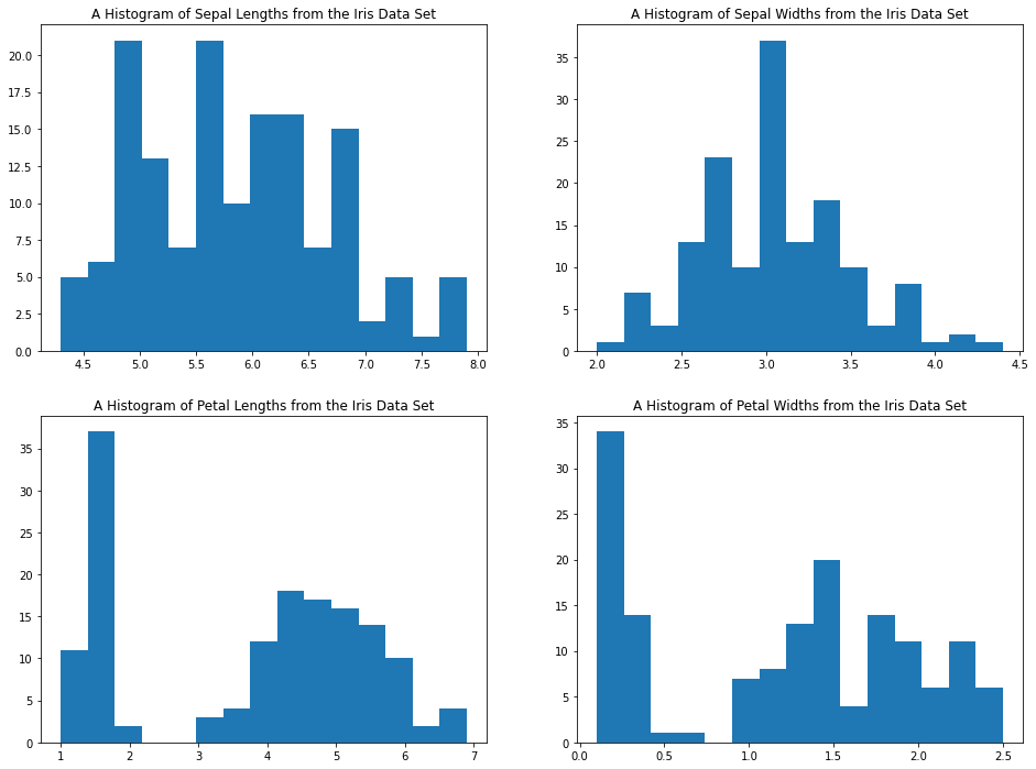
Example #2: A 2x3 Subplot Grid
For this example, let's again import the wine quality data set from the UCI Machine Learning Repository. The import is below:
wine_data = pd.read_csv('http://archive.ics.uci.edu/ml/machine-learning-databases/wine-quality/winequality-red.csv', sep=';')Let's create a 2x3 subplot with the following plots (in the order they're listed):
chloridesqualityalcoholdensitytotal sulfur dioxidecitric acid
Let's make each subplot a scatterplot, with the x-variable for each scatterplot being fixed acidity. Name each plot with an appropriate title for an outside reader to understand it.
Give this a try yourself before proceeding!
Once you have attempted this on your own, you can view the code below for a full solution:
x = wine_data['fixed acidity']

plt.subplot(2,3,1)

plt.scatter(x, wine_data['chlorides'])

plt.title('Chlorides plotted against Fixed Acidity')

plt.subplot(2,3,2)

plt.scatter(x, wine_data['quality'])

plt.title('Quality plotted against Fixed Acidity')

plt.subplot(2,3,3)

plt.scatter(x, wine_data['alcohol'])

plt.title('Alcohol plotted against Fixed Acidity')

plt.subplot(2,3,4)

plt.scatter(x, wine_data['density'])

plt.title('Density plotted against Fixed Acidity')

plt.subplot(2,3,5)

plt.scatter(x, wine_data['total sulfur dioxide'])

plt.title('Total Sulfur Dioxide plotted against Fixed Acidity')

plt.subplot(2,3,6)

plt.scatter(x, wine_data['citric acid'])

plt.title('Citric Acid plotted against Fixed Acidity')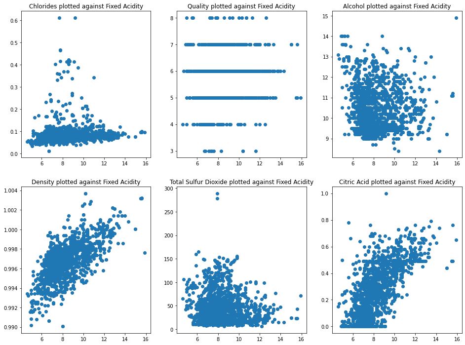
The plt.tight_layout Method.
While creating Python visualizations, you will often encounter situations where your subplots have axis labels that overlap one another.
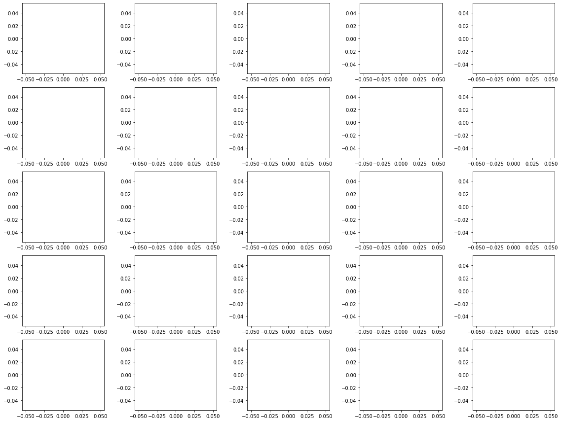
As an example, let's run the following code to create 25 empty matplotlib plots:
#Import the necessary Python libraries

import matplotlib.pyplot as plt

import numpy as np

#Set matplotlib to display plots inline in the Jupyter Notebook

%matplotlib inline

#Resize the matplotlib canvas

plt.figure(figsize=(16,12))

#Create 16 empty plots

for x in (np.arange(25)+1):

    plt.subplot(5,5,x)

    plt.plot()
Here is the output of this code:
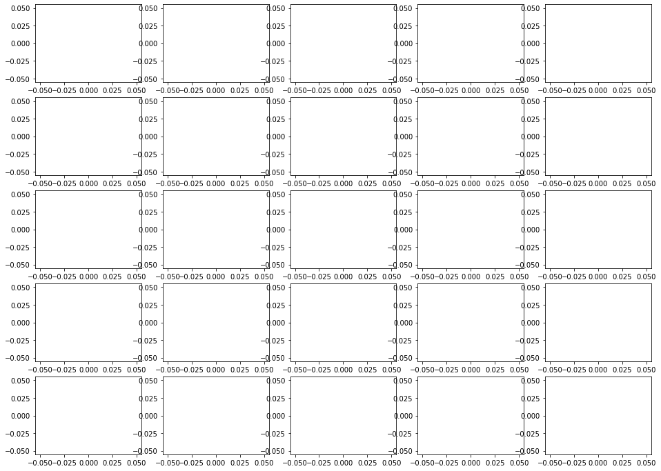
As you can see, the axis labels in these subplots overlap one another. This is visually unappealing.
If you add the plt.tight_layout() statement to the end of this code block, this problem resolves itself. Here is the same output with the added statement:
Moving On
In this lesson, we learned how to create subplot grids in Python using matplotlib. Subplots are an important part of your Python visualization toolkit.