
A Guide to Python Correlation Statistics with NumPy, SciPy, & Pandas
When dealing with data, it's important to establish the unknown relationships between various variables.
Other than discovering the relationships between the variables, it is important to quantify the degree to which they depend on each other.
Such statistics can be used in science and technology.
Python provides its users with tools that they can use to calculate these statistics.
In this article, I will help you know how to use SciPy, Numpy, and Pandas libraries in Python to calculate correlation coefficients between variables.
Table of Contents
You can skip to a specific section of this Python correlation statistics tutorial using the table of contents below:
- What is Correlation?
- Correlation Calculation using NumPy
- Correlation Calculation using SciPy
- Correlation Calculation in Pandas
- Pearson correlation in Pandas
- Visualizing Correlation
- Heatmaps of Correlation Matrices
- Final Thoughts
What is Correlation?
The variables within a dataset may be related in different ways.
For example,
One variable may be dependent on the values of another variable, two variables may be dependent on a third unknown variable, etc.
It will be better in statistics and data science to determine the undelying relationship between variables.
Correlation is the measure of how two variables are strongly related to each other.
Once data is organized in the form of a table, the rows of the table become the observations while the columns become the features or the attributes.
There are three types of correlation.
They include:
-
Negative correlation- This is a type of correlation in which large values of one feature correspond to small values of another feature.
If you plot this relationship on a cartesian plane, the y values will decrease as the x values increase.
The vice versa is also true, that small values of one feature correspond to large features of another feature.
If you plot this relationship on a cartesian plane, the y values will increase as the x values decrease.
-
Weak or no correlation- In this type of correlation, there is no observable association between two features.
The reason is that the correlation between the two variables is weak.
-
Positive correlation- In this type of correlation, large values for one feature correspond to large values for another feature.
When plotted, the values of y tend to increase with an increase in the values of x, showing a strong correlation between the two.
Correlation goes hand-in-hand with other statistical quantities like the mean, variance, standard deviation, and covariance.
In this article, we will be focussing on the three major correlation coefficients.
These include:
- Pearson’s r
- Spearman’s rho
- Kendall’s tau
The Pearson's coefficient helps to measure linear correlation, while the Kendal and Spearman coeffients helps compare the ranks of data.
The SciPy, NumPy, and Pandas libraries come with numerous correlation functions that you can use to calculate these coefficients.
If you need to visualize the results, you can use Matplotlib.
Correlation Calculation using NumPy
NumPy comes with many statistics functions.
An example is the np.corrcoef() function that gives a matrix of Pearson correlation coefficients.
To use the NumPy library, we should first import it as shown below:
import numpy as npNext, we can use the ndarray class of NumPy to define two arrays.
We will call them x and y:
import numpy as np
x = np.arange(10, 20)
y = np.array([3, 2, 6, 5, 9, 12, 16, 32, 88, 62])
You can see the generated arrays by typing their names on the Python terminal as shown below:
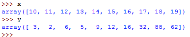
First, we have used the np.arange() function to generate an array given the name x with values ranging between 10 and 20, with 10 inclusive and 20 exclusive.
We have then used np.array() function to create an array of arbitrary integers.
We now have two arrays of equal length.
You can use Matplotlib to plot the datapoints:
import numpy as np
from matplotlib import pyplot as plt

x = np.arange(10, 20)
y = np.array([3, 2, 6, 5, 9, 12, 16, 32, 88, 62])
plt.scatter(x,y)
plt.legend(['Data points'])
plt.show()
This will return the following plot:
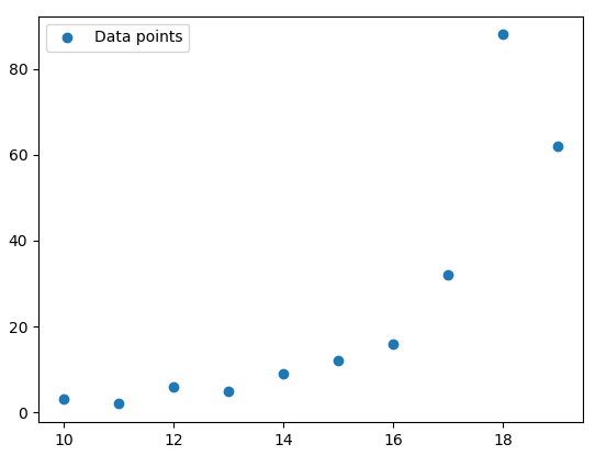
The colored dots are the datapoints.
It's now time for us to determine the relationship between the two arrays.
We will simply call the np.corrcoef() function and pass to it the two arrays as the arguments.
This is shown below:
corr = np.corrcoef(x, y)Now, type corr on the Python terminal to see the generated correlation matrix:
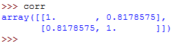
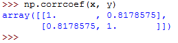
The correlation matrix is a two-dimensional array showing the correlation coefficients.
If you've observed keenly, you must have noticed that the values on the main diagonal, that is, upper left and lower right, equal to 1.
The value on the upper left is the correlation coefficient for x and x.
The value on the lower right is the correlation coefficient for y and y.
In this case, it's approximately 8.2.
They will always give a value of 1.
However, the lower left and the upper right values are of the most signicance and you will need them frequently.
The two values are equal and they denote the pearson correlation coefficient for variables x and y.
Correlation Calculation using SciPy
SciPy has a module called scipy.stats that comes with many routines for statistics.
To calculate the three coefficients that we mentioned earlier, you can call the following functions:
- pearsonr()
- spearmanr()
- kendalltau()
Let me show you how to do it...
First, we import numpy and the scipy.stats module from SciPy.
Next, we can generate two arrays.
This is shown below:
import numpy as np
import scipy.stats
x = np.arange(10, 20)
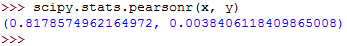
y = np.array([3, 2, 6, 5, 9, 12, 16, 32, 88, 62])You can calculate the Pearson's r coefficient as follows:
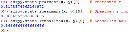
scipy.stats.pearsonr(x, y)This should return the following:
The value for Spearman's rho can be calculated as follows:
scipy.stats.spearmanr(x, y)You should get this:

And finally, you can calculate the Kendall's tau as follows:
scipy.stats.kendalltau(x, y)The output should be as follows:

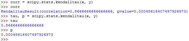
The output from each of the three functions has two values.
The first value is the correlation coefficient while the second value is the p-value.
In this case, our great focus is on the coefficient correlation, the first value.
The p-value becomes useful when testing hypothesis in statistical methods.
If you only want to get the correlation coefficient, you can extract it using its index.
Since it's the first value, it's located at index 0.
The following demonstrates this:
scipy.stats.pearsonr(x, y)[0]    # Pearson's r
scipy.stats.spearmanr(x, y)[0]   # Spearman's rho
scipy.stats.kendalltau(x, y)[0]  # Kendall's tau
Each should return one value as shown below:
Correlation Calculation in Pandas
In some cases, the Pandas library is more convenient for calculating statistics compared to NumPy and SciPy.
It comes with statistical methods for DataFrame and Series data instances.
For example, if you have two Series objects with equal number of items, you can call the .corr() function on one of them with the other as the first argument.
First, let's import the Pandas library and generate a Series data object with a set of integers:
import pandas as pd

x = pd.Series(range(20, 30))
To see the generated Series, type x on Python terminal:
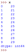
It has generated numbers between 20 and 30, with 20 inclusive and 30 exclusive.
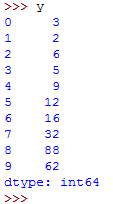
We can generate the second Series object:
y = pd.Series([3, 2, 6, 5, 9, 12, 16, 32, 88, 62])To see the values for this series object, type y on the Python terminal:
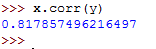
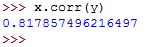
To calculate the Pearson's r coefficient for x in relation to y, we can call the .corr() function as follows:
x.corr(y) This returns the following:
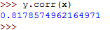
The Pearson's r coefficient for y in relation to x can be calculated as follows:
y.corr(x) This should return the following:
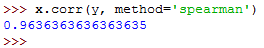
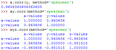
You can then calculate the Spearman's rho as follows:
x.corr(y, method='spearman')Note that we had to set the parameter method to spearman.
It should return the following:
The Kendall's tau can then be calculated as follows:
x.corr(y, method='kendall')It returns the following:
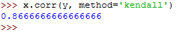
The method parameter was set to kendall.
Linear Correlation
The purpose of linear correlation is to measure the proximity of a mathematical relationship between the variables of a dataset to a linear function.
If the relationship between the two variables is found to be closer to a linear function, then they have a stronger linear correlation and the absolute value of the correlation coefficient is higher.
Pearson Correlation Coefficient
Let's say you have a dataset with two features, x and y.
Each of these features has n values, meaning that x and y are n tuples.
The first value of feature x, x1 corresponds to the first value of feature y, y1.
The second value of feature x, x2, corresponds to the second value of feature y, y2.
Each of the x-y pairs denotes a single observation.
The Pearson (product-moment) correlation coefficient measures the linear relationship between two features.
It is simply the ratio of the covariance of x and y to the product of their standard deviations.
It is normally denoted using the letter r and it can be expressed using the following mathematical equation:
r = Σᵢ((xᵢ − mean(x))(yᵢ − mean(y))) (√Σᵢ(xᵢ − mean(x))² √Σᵢ(yᵢ − mean(y))²)⁻¹
The parameter i can take the values 1, 2,...n.
The mean values for x an y can be denoted as mean(x) and mean(y) respectively.
Note the following facts regarding the Pearson correlation coefficient:
- It can take any real values ranging between −1 ≤ r ≤ 1.
- The maximum value of r is 1, and it denotes a case where there exists a perfect positive linear relationship between
xandy. - If r > 0, there is a positive correlation between
xandy. - If r = 0,
xandyare independent. - If r < 0, there is a negative correlation between
xandy. - The minimum value of r is 1, and it denotes a case where there is a perfect negative linear relationship between
xandy.
So, a larger absolute value of r is an indication of a stronger correlation, closer to a linear function.
While, a smaller absolute value of r is an indication of a weaker correlation.
Linear Regression in SciPy
SciPy can give us a linear function that best approximates the existing relationship between two arrays and the Pearson correlation coefficient.
So, let's first import the libraries and prepare the data:
import numpy as np
import scipy.stats

x = np.arange(20, 30)
y = np.array([3, 2, 6, 5, 9, 12, 16, 32, 88, 62])
Now that the data is ready, we can call the scipy.stats.linregress() function and perform linear regression.
This is shown below:
output = scipy.stats.linregress(x, y)We are performing linear regression between the two features, x and y.
Let's get the values of different coefficients:
output.slope
output.intercept
output.rvalue
output.pvalue
output.stderr
These should run as follows:
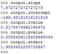
So, you've used linear regression to get the following values:
- slope- This is the slope for the regression line.
- intercept- This is the intercept for the regression line.
- pvalue- This is the p-value.
- stderr- This is the standard error for the estimated gradient.
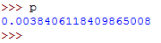
Pearson Correlation in NumPy and SciPy
At this point, you know how to use the corrcoef() and pearsonr() functions to calculate the Pearson correlation coefficient.
This is shown below:
r, p = scipy.stats.pearsonr(x, y)Run the above command then access the values of r and p by typing them on the terminal.
The value of r should be as follows:
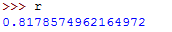
The value of p should be as follows:
Here is how to use the corrcoef() function:
np.corrcoef(x, y)It should return the following:
Note that if you pass an array with a nan value to the pearsonr() function, it will return a ValueError.
There are a number of details that you should consider.
First, remember that the np.corrcoef() function can take two NumPy arrays as arguments.
You can instead pass to it a two-dimensional array with similar values as the argument.
Let's first create the two-dimensional array:
xy = np.array([[20, 21, 22, 23, 24, 25, 26, 27, 28, 29],
               [3, 2, 6, 5, 9, 12, 16, 32, 88, 62]])
Let's now call the function:
np.corrcoef(xy)This returns the following:
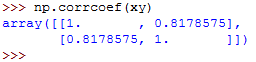
We get similar results as in the previous examples.
So, let's see what happens when you pass nan data to corrcoef():
arr_with_nan = np.array([[10, 1, 12, 23],
                    [22, 4, 11, 8],
                    [13, 6, np.nan, 8]])
This returns the following:
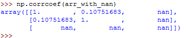
In the above example, the third row of the array has a nan value.
Every calculation that didn't involve the feature with nan value was calculated well.
However, all the results that dependent on the last row are nan.
Pearson correlation in Pandas
First, let's import the Pandas library and create Series and DataFrame data objects:
import pandas as pd
import sys

sys.__stdout__ = sys.stdout

x = pd.Series(range(20, 30))
y = pd.Series([3, 2, 6, 5, 9, 12, 16, 32, 88, 62])
z = pd.Series([6, 3, 2, 5, 0, -4, -8, -12, -15, -17])
xy = pd.DataFrame({'x-values': x, 'y-values': y})
xyz = pd.DataFrame({'x-values': x, 'y-values': y, 'z-values': z})
Above, we have created two Series data obects named x, y, and z and two DataFrame data objects named xy and xyz.
To see any of them, type its name on the Python terminal.
See the use of the sys library.
It has helped us provide output information to the Python interpreter.
At this point, you know how to use the .corr() function on Series data objects to get the correlation coefficients.
x.corr(y)The above returns the following:
We called the .corr() function on one object and passed the other object to the function as an argument.
The .corr() function can also be used on DataFrame objects.
It can give you the correlation matrix for the columns of the DataFrame object:
For example:
corr_matrix = xy.corr()The above code gives us the correlation matrix for the columns of the xy DataFrame object.
To see the generated correlation matrix, type its name on the Python terminal:
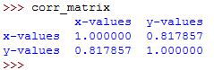
The resulting correlation matrix is a new instance of DataFrame and it has the correlation coefficients for the columns xy['x-values'] and xy['y-values'].
Such labeled results are very convenient to work with since they can be accessed with either their labels or with their integer position indices.
This is shown below:
corr_matrix.at['x-values', 'y-values']
corr_matrix.iat[0, 1]
The two run as follows:
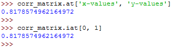
The above examples show that there are two ways for you to access the values:
- The
.at[]accesses a single value by row and column labels. - The
.iat[]accesses a value based on its row and column positions.
Rank Correlation
Rank correlation compares the orderings or the ranks of the data related to two features or variables of a dataset.
If the orderings are found to be similar, then the correlation is said to be strong, positive, and high.
On the other hand, if the orderings are found to be close to reversed, the correlation is said to be strong, negative, and low.
Spearman Correlation Coefficient
This is the Pearson correlation coefficient between the rank values of two features.
It's calculated just as the Pearson correlation coefficient but it uses the ranks instead of their values.
It's denoted using the Greek letter rho (ρ), the Spearman’s rho.
Here are important points to note concerning the Spearman correlation coefficient:
- The ρ can take a value in the range of −1 ≤ ρ ≤ 1.
- The maximum value of ρ is 1, and it corresponds to a case where there is a monotonically increasing function between x and y. Larger values of x correspond to larger values of y. The vice versa is also true.
- The minimum value of ρ is -1, and it corresponds to a case where there is a monotonically decreasing function between x and y. Larger values of x correspond to smaller values of y. The vice versa is also true.
Kendall Correlation Coefficient
Let's consider two n-tuples again, x and y.
Each x-y, pair, (x1, y1)..., denotes a single observation.
Each pair of observations, (xᵢ, yᵢ), and (xⱼ, yⱼ), where i < j, will be one of the following:
- concordant if
(xᵢ > xⱼandyᵢ > yⱼ)or(xᵢ < xⱼandyᵢ < yⱼ) - discordant if
(xᵢ < xⱼandyᵢ > yⱼ)or(xᵢ > xⱼandyᵢ < yⱼ) - neither if a tie exists in either
x(xᵢ = xⱼ)or iny(yᵢ = yⱼ)
The Kendall correlation coefficient helps us compare the number of concordant and discordant data pairs.
The coefficient shows the difference in the counts of concordant and discordant pairs in relation to the number of x-y pairs.
Note the following points concerning the Kendall correlation coefficient:
- It takes a real value in the range of −1 ≤ τ ≤ 1.
- It has a maximum value of τ = 1 which corresponds to a case when all pairs are concordant.
- It has a minimum value of τ = −1 which corresponds to a case when all pairs are discordant.
SciPy Implementation of Rank
The scipy.stats can help you determine the rank of each value in an array.
Let's first import the libraries and create NumPy arrays:
import numpy as np
import scipy.stats

x = np.arange(20, 30)
y = np.array([3, 2, 6, 5, 9, 12, 16, 32, 88, 62])
z = np.array([6, 3, 2, 5, 0, -4, -8, -12, -15, -17])
Now that the data is ready, let's use the scipy.stats.rankdata() to calculate the rank of each value in a NumPy array:
scipy.stats.rankdata(x)
scipy.stats.rankdata(y)
scipy.stats.rankdata(z)
The commands return the following:
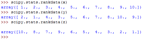
The array x is monotonic, hence, its rank is also monotonic.
The rankdata() function also takes the optional parameter method.
This tells the Python compiler what to do in case of ties in the array.
By default, the parameter will assign them the average of the ranks.
For example:
scipy.stats.rankdata([7, 2, 9, 2])This returns the following:
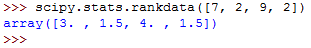
In the above array, there are two values with a value of 2.
Their total rank is 3.
When averaged, each value got a rank of 1.5.
You can also get ranks using the np.argsort() function.
For example:
np.argsort(y) + 2Which returns the following ranks:

The argsort() function returns the indices of the array items in the asorted array.
The indices are zero-based, so, you have to add 1 to all of them.
Rank Correlation Implementation in NumPy and SciPy
You can use the scipy.stats.spearmanr() to calculate the Spearman correlation coefficient.
For example:
corr = scipy.stats.spearmanr(x, y)This runs as follows:
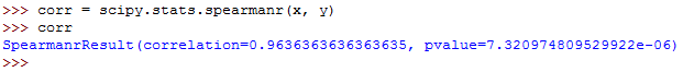
The values for both the correlation coefficient and the pvalue have been shown.
The rho value can be calculated as follows:
rho, p = scipy.stats.spearmanr(x, y)This will run as follows:
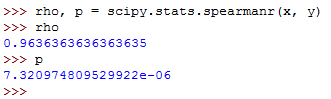
So, the spearmanr() function returns an object with the value of Spearman correlation coefficient and p-value.
To get the Kendall correlation coefficient, you can use the kendalltau() function as shown below:
corr = scipy.stats.kendalltau(x, y)
tau, p = scipy.stats.kendalltau(x, y)
The commands will run as follows:
Rank Correlation Implementation in Pandas
You can use the Pandas library to calculate the Spearman and kendall correlation coefficients.
First, import the Pandas library and create the Series and DataFrame data objects:
import pandas as pd
import numpy as np
import sys

sys.__stdout__ = sys.stdout

x = np.arange(20, 30)
y = np.array([3, 2, 6, 5, 9, 12, 16, 32, 88, 62])
z = np.array([6, 3, 2, 5, 0, -4, -8, -12, -15, -17])

x, y, z = pd.Series(x), pd.Series(y), pd.Series(z)
xy = pd.DataFrame({'x-values': x, 'y-values': y})
xyz = pd.DataFrame({'x-values': x, 'y-values': y, 'z-values': z})
You can now call the .corr() and .corrwith() functions and use the method parameter to specify the correlation coefficient that you want to calculate.
It defaults to pearson.
Consider the code given below:
x.corr(y, method='spearman')
xy.corr(method='spearman')
xyz.corr(method='spearman')
The commands will run as follows:
That's how to use the method parameter with the .corr() function.
To calculate the Kendall's tau, use method=kendall.
This is shown below:
x.corr(y, method='kendall')
xy.corr(method='kendall')
xyz.corr(method='kendall')
The commands will return the following output:
Visualizing Correlation
Visualizing your data can help you gain more insights about the data.
Luckily, you can use Matplotlib to visualize your data in Python.
If you haven't installed the library, install it using the pip package manager.
Just run the following command:
pip3 install matplotlibNext, import its pyplot module by running the following command:
import matplotlib.pyplot as pltYou can then create the arrays of data that you will use to generate the plot:
import numpy as np

x = np.arange(20, 30)
y = np.array([3, 2, 6, 5, 9, 12, 16, 32, 88, 62])
z = np.array([6, 3, 2, 5, 0, -4, -8, -12, -15, -17])
The data is now ready, hence, you can draw the plot.
We will first demonstrate how to create an x-y plot with a regression line, equation, and Pearson correlation coefficient.
You can use the linregress() function to get the slope, the intercept, and the correlation coefficient for the line.
First, import the stats module from SciPy:
import scipy.statsThen run this code:
slope, intercept, r, p, stderr = scipy.stats.linregress(x, y)Also, you can get the string with the equation of regression line and the value of correlation coefficient.
You can use f-strings:
line = f'Regression line: y={intercept:.2f}+{slope:.2f}x, r={r:.2f}'Note that the above line will only work if you are using Python 3.6 and above (f-strings were introduced in Python 3.6).
Now, let's call the .plot() function to generate the x-y plot:
fig, ax = plt.subplots()
ax.plot(x, y, linewidth=0, marker='s', label='Data points')
ax.plot(x, intercept + slope * x, label="Regression Line")
ax.set_xlabel('x')
ax.set_ylabel('y')
ax.legend(facecolor='white')
plt.show()
The code will generate the following plot:
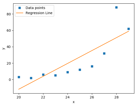
The blue squares on the plot denote the observations, while the yellow line is the regression line.
Heatmaps of Correlation Matrices
The correlation matrix can be big and confusing when you are handling a huge number of features.
However, you can use a heat map to present it and each field will have a color that corresponds to its value.
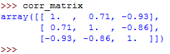
You should have a correlation matrix, so, let's create it.
First, this is our array:
xyz = np.array([[11, 12, 12, 14, 14, 15, 18, 17, 18, 20],
                 [2, 3, 4, 5, 9, 12, 18, 25, 96, 50],
                 [5, 3, 2, 4, 0, -2, -8, -11, -17, -18]])
Now, let's generate the correlation matrix:
corr_matrix = np.corrcoef(xyz).round(decimals=2)When you type the name of the correlation matrix on the Python terminal, you will get this:
You can now use the .imshow() function to create the heatmap, and pass the name of the correlation matrix to it as the argument:
fig, ax = plt.subplots()
im = ax.imshow(corr_matrix)
im.set_clim(-1, 1)
ax.grid(False)
ax.xaxis.set(ticks=(0, 1, 2), ticklabels=('x', 'y', 'z'))
ax.yaxis.set(ticks=(0, 1, 2), ticklabels=('x', 'y', 'z'))
ax.set_ylim(2.5, -0.5)
for i in range(3):
    for j in range(3):
        ax.text(j, i, corr_matrix[i, j], ha='center', va='center',
                color='r')
cbar = ax.figure.colorbar(im, ax=ax, format='% .2f')
plt.show()
The following heatmap will be generated:
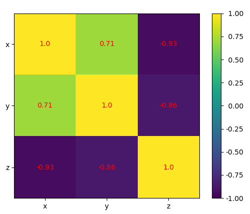
The result shows a table with coefficients.
The colors on the heatmap will help you interpret the output.
We have three different colors representing different numbers.
Final Thoughts
This is what you've learned in this article:
- Correlation coeffients measure the association between the features or variables of a dataset.
- The most popular correlation coefficients include the Pearson’s product-moment correlation coefficient, Spearman’s rank correlation coefficient, and Kendall’s rank correlation coefficient.
- The NumPy, Pandas, and SciPy libraries come with functions that you can use to calculate the values of these correlation coefficients.
- Visualing your data will help you gain more insights from the data.
- You can use Matplotlib to visualize your data in Python.